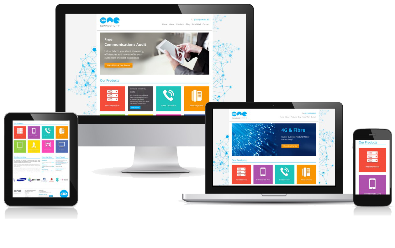
Responsive web design (RWD) creates a system for a single site to react to the size of a user’s device—with one URL and one content source. A responsive website has a fluid and flexible layout which adjusts according to screen size.
The importance of responsive web design is that it offers an optimized browsing experience. Basically, your website will look great and work well on a desktop (or laptop), a tablet, and a mobile phone’s browser.
In the past, developers built more than one site in order to accommodate different screen sizes. With the number of device types out there on the market today, this seems completely inefficient. Right?
“Responsive web design offers us a way forward, finally allowing us to design for the ebb and flow of things.” -Ethan Marcotte
Now you can understand why responsive web design is not a shiny trend anymore, but more of a shift in the thinking behind building websites. Having a mobile responsive website is not just another option—it’s a requirement!


0 Comments